Logos are the first visual explainer of a brand’s identity. The colours, the shapes, the text, the font, the size, the shape, every aspect of it has a purpose that signifies what an organization stands for.
When we started Project KHEL 7 years back, we wanted to invest every penny we have into working with our children. So, to begin with, we put together a logo out of free stock images. It basically was 3 colourful abstract figures, holding hands in a circle and text that said Project KHEL. It served us well for 7 long years and as we are growing bigger with our work and our team and the number of people we are working with, and have increased clarity in what we are doing and intend to see ourselves impact, it only made sense to invest in a logo that represents US, our value system, our heart and what we are here to do.
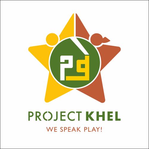
So here is introducing Our new logo that is out and out about Project KHEL-
ELEMENTS:
1. STAR: If you look at the star closely, you’ll see a girl and a boy high fiving each other! The star reflects Gender equality, the strongest over-arching message we strive to deliver across all our programmes. Stars also stand for outstanding people within a domain, like the film stars or sports stars and having both girls and boys reflect in this states our intention that both have equal potential of being stars within their own workspaces and also that having a gender equal and integrated society could make the entire community, the city/village, the nation and the world a star!
2. HIGH FIVE: The high five in the logo deserves a mention of its own. It is one of the most positive actions on the playground that you will often see us using to encourage a teammate or a fellow, to celebrate a win or a job well done. Also, we use it as a greeting, where the children run in high five us, expressing their happiness at meeting us and we also always close with a high five, leaving the children on a positive high, with a promise that we’ll be back the next day.
3. P and Khe (in hindi): We work in Uttar Pradesh, and therefore the language we deliver our programme in is Hindi and we also have all our documentation and communication in English. Also, we often see our children feel bad about not knowing English fluently enough and we can’t stress enough that responsible communication in any language, that helps the other person understand what they need to is all that is needed. So this is our little attempt to language inclusivity and equality.
4. WE SPEAK PLAY: While working on the logo, we had various discussions on whether to continue with the previous tagline and we unanimously agreed that our strong-point lies in creating play-based curriculums and gamifying information delivery of all kinds, so it only makes sense to say that we do speak play!
COLOURS:
1. Green – The colour signifies nature, open spaces, a playground. The playground is our classroom. Do notice how the playground actually is at the heart of the logo, just like playing is the central element of how we go about delivering our work.
2. Rust – The rust colour is the earth, the soil – our roots. Apart from the fact that the soil is also an element of the outdoors, we take immense pride in customizing our interventions for our children, with full consciousness of who they are and where they come from.
3. Yellow – The shade of yellow we’ve chosen for our logo is bright, it is vibrant, it is deep and it represents our children who we work with. Yellow is also for sunshine that is abundantly available outdoors, the sunshine that nurtures, that helps you grow, that makes your day beautiful, as do our children, who are our sunshine!